The Good Cop
Brief
To brew and create the ultimate coffee brand for the hustle and bustle of today’s generation! The vision was to make ‘The Good Cop’ the perfect partner in crime for those hectic days when one needs a caffeine fix to keep them on top of their game!
Deliverables
Naming
Branding
Packaging
Name
The Good Cop is the brand for all the coffee lovers. We wanted a name that had a bit of a millennial flair, something that screamed hustle culture. So, after hours of brainstorming, we landed on “The Good Cop” – it just fit. The name perfectly captures the product’s story – it’s the ultimate discipline maker, the officer on duty, the one who keeps you in line.
We took a cue from the boys in blue and landed on the perfect name for the coffee brand. After all, who better to keep us in line than the ultimate authority figure? We believe that “The Good Cop” is the ultimate “partner in crime” for all the coffee lovers out there. It strikes the perfect balance between quirkiness and discipline. A beverage that’s worth following the law for!
Logo and Brand Identity
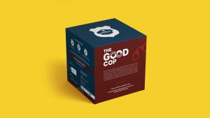
We went with a minimalistic vibe for the brand’s logo, incorporating a rich colour palette of brown and dark blue. The word “Good” features two Os that can be interpreted as either handcuffs or coffee mugs when viewed from above. As for the mascot, we opted for a peaked or police cap, and the font we chose is simple yet oh-so-easy on the eyes.
But that’s not all, the brand’s elements and write-up are playful, witty, and downright fun to read, with a millennial lingo. When listing the ingredients, we tossed in some delightful elements like “providing the motivation to hustle” and “adrenaline activators.” After all, The Good Cop is all about catering to coffee lovers who are always on the go and embracing today’s hustle culture.

Packaging
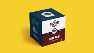
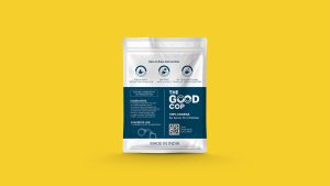
We’ve gone to great lengths to ensure that the packaging for the product is both clean and elegant, featuring 10 energetic servings housed within a sleek mono-carton box. Staying true to the brand’s identity, we’ve opted to use the same premium blue and classic brown colours found in the logo and mascot to give the product a premium feel through the use of solid shades and a matte finish. The trusty mascot is even making an appearance on the sachet itself, serving as a constant reminder of the amazingness inside that can serve as the brand’s identity.


