A New Shade of Creativity
27 April 2022
Pantone’s choice of Colour of The Year 2022

It is the first time in the history of the Pantone Institute that a new colour has been created to
be declared Colour of the Year. It is also the first time in a long time that the human race is
emerging out of a period of isolation, slumber and intense adversity.
Pantone’s Colour of the Year has been going on for more than 20 years, influencing products
across fashion, home furnishings, and industrial design, making the Pantone Color Institute
a dominant trend forecaster in the world of art, design, architecture, and fashion.
For the Pantone Colour of the Year selection process, colour experts at the Pantone Colour
Institute comb the world looking for new colour influences, from the entertainment industry
to fashion, travel destinations and socio-economic conditions. Influences can also stem
from new technologies, materials, textures, social media platforms and even upcoming
sporting events that capture worldwide attention.
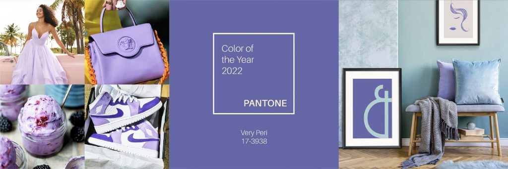
Pantone, the global authority on colour, has picked ‘Very Peri’ as the colour of the year for
2022. The globally renowned institute describes Very Peri as “a dynamic periwinkle blue hue
with a vivifying violet-red undertone blends the faithfulness and constancy of blue with the
energy and excitement of red”.
This new Pantone Color symbolises a courageous presence which motivates creativity. By
blending the consistency and familiarity of the shade of blue along with the thrill of this
particular red, this year’s colour reflects trust and seriousness while emoting passion and
creativity, parallely.
Pantone’s choice of colour is held in such high regard globally, that this year Microsoft has
collaborated with Pantone to introduce Very Peri to Microsoft Paint and available to users.
“As we move into a world of unprecedented change, the selection of Very Peri brings a novel
perspective and vision of the trusted and beloved blue color family. Encompassing the
qualities of the blues, yet at the same time possessing a violet-red undertone, Very Peri
displays a spritely, joyous attitude and dynamic presence that encourages courageous
creativity and imaginative expression.” says Leatrice Eiseman, Executive Director, Pantone
Color Institute.
We are emerging from a period of tardiness which has evolved our thinking. Our digital and
real lives have blended more than ever. It is this merger that has allowed the exploration of
the limits of reality, opening doors to create new possibilities – such as the this new colour.
The colour of the year PANTONE 17-3938 Very Peri illustrates the fusion of modern life and
creative ideas, which is why it is not only a trendsetter but will make way as a game changer
in the field of design.
By Rishleen Bajaj